CROs: can you visualize which revenue leaders impact business outcomes?
VPs: can you visualize your managers’ daily coaching operations and determine, using data, who helps reps evolve to meet targets?
Frontline managers: can you visualize your body of work?
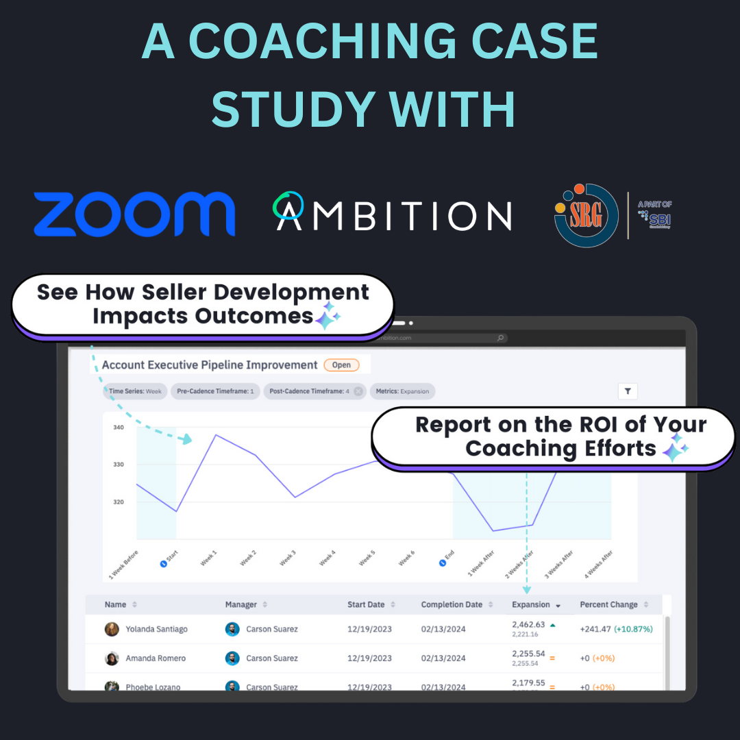
As of today, GTM leaders like yourselves are able to create a graph that answers all of these questions using our newest coaching automations and GTM data visualizations.
Our coaching effectiveness graph is embedded into our coaching platform and systematically analyzes manager <> rep coaching interactions over time and their effect on key business drivers like pipeline creation, meetings held, or closed/won revenue.
Hear the “why” behind the graph from Ambition co-founder and CRO Jared Houghton >>
For the first time, organizations don’t need full-time enablement, RevOps, and BI analysts to produce this performance data. Once key metrics are selected, Ambition will instantly track the performance of each employee against these metrics in real-time, free of the steps it would historically take to get out of a BI tool.
At Ambition, we believe that the most modern measure of revenue attainment is coaching effectiveness, and this KPI can now make its way into the boardroom. If you already have Ambition, here’s a quick guide on how to build your first graph.
How to create a sales coaching effectiveness graph in Ambition
First, you’ll choose metrics to correlate in the Cadence edit/create form. These will be the default in your coaching effectiveness graph.
Below is a sales onboarding example. You can see that the graph shows multiple metrics. Employees can have different start and end dates and they’re all still included in the average. Plus, the graph shows metrics changes on average across the employee’s time in the cadence.
This helps answer questions like, “Did the manager <> rep coaching touch points have a business impact?” or “Are onboarding employees hitting their goals?”
Underneath the graph shows the who in the data visual. Here, you can look at all of the individual participants to see how they did. “Who did the cadence work for?” and “Who didn’t it work for?” Comparing each user’s ending performance back to their baseline total illustrates the effectiveness of coaching over time.
To learn more about the sales coaching effectiveness graph and other ways to elevate your performance management practices in 2024, message me here, email your CSM, or fill out this form.
 Back
Back


